Blog
Menu Design Tips That Drive Restaurant Sales
Discover effective menu design tips to boost restaurant sales, enhance customer choices, and transform your dining experience. Start improving today!
Menu Design Tips That Drive Restaurant Sales
TL;DR:
- Effective menu design uses strategic item placement, limited sections, and sensory descriptions to boost sales. Regular analysis and updates ensure the menu remains profitable and engaging for guests.
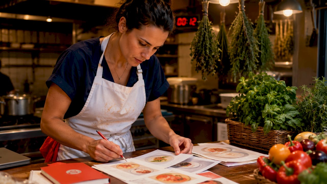
Menu design is the strategic practice of crafting your restaurant’s menu to guide customer choices, increase average spend, and improve the overall dining experience. A well-designed menu is not decoration. It is a sales tool. Strategic item placement can boost sales of target dishes by up to 30%. That single fact should change how you think about every layout decision you make.
The industry term for this discipline is menu engineering. It combines psychology, graphic design, and food cost analysis to make your menu work harder for your bottom line. The menu design tips in this article cover visual hierarchy, typography, pricing psychology, and digital integration, giving you a complete framework to act on today.
1. Use visual hierarchy to highlight profitable dishes
Visual hierarchy is the practice of arranging elements so the eye lands on the most important items first. On a restaurant menu, that means your highest-margin dishes should occupy the prime real estate.
The top-right corner and upper-left zone are where most guests look first. Place your signature dishes and high-margin items in those spots. Use visual cues like bordered boxes, color accents, and generous white space to make those items stand out without cluttering the page.
White space acts as an active design element, not empty filler. It draws the eye toward featured items and makes the menu feel less overwhelming to read. A crowded menu signals low quality; a well-spaced menu signals confidence.
Pro Tip: Place your single most profitable dish in the top-right corner of your main food page. That position gets the most eye contact before a guest scans the rest of the menu.
2. Apply menu engineering frameworks
Menu engineering methods like Stars and Plowhorses give you a data-driven way to decide which items deserve emphasis and which ones should be cut. Stars are high-popularity, high-margin items. Plowhorses are popular but low-margin. Puzzles are high-margin but rarely ordered. Dogs are low on both counts.
Once you categorize your dishes, your design decisions become obvious. Stars get prime placement and visual emphasis. Plowhorses get repositioned or repriced. Puzzles get better descriptions to drive trial. Dogs get removed.
This framework turns menu layout from guesswork into a repeatable process. You can run this analysis quarterly as your food costs and sales data shift. For a deeper look at applying this method, the menu optimization guide on the Sorbey blog walks through the full process with practical examples.
3. Limit sections to prevent decision fatigue
Capping each menu section at around seven items prevents decision fatigue and pushes guests toward your signature offerings. When a section has 20 options, guests freeze. When it has seven, they choose faster and feel better about their choice.
This principle comes from cognitive psychology. The human brain handles roughly seven chunks of information at once before performance drops. Apply that to your appetizers, entrees, and desserts separately.
Fewer items also mean lower food costs, less kitchen complexity, and fresher ingredients. Cutting your menu is one of the highest-return moves a restaurant manager can make.
4. Choose fonts that are readable under real lighting
Menu typography advice starts with one non-negotiable rule: guests must be able to read your menu in dim restaurant lighting without squinting. Body text should be at least 11pt, and you should test your printed menu under the actual lighting conditions of your dining room before you finalize it.
Limit your menu to two typefaces. One for headers and branding, one for body text and item descriptions. More than two fonts creates visual noise and makes the menu feel unpolished.
- Use a clean serif or sans-serif for item names and descriptions
- Reserve decorative or script fonts for the cover and section headers only
- Maintain high contrast between text and background color
- Avoid light gray text on white backgrounds, which fails in low light
Pro Tip: Print a full-size proof of your menu and read it at your dimmest table at dinner service. If you struggle, your guests will too.
5. Write descriptions that sell without overselling
Descriptive sensory language in menu item descriptions can increase sales by 27% compared to plain listings. That is a significant lift from a few well-chosen words. “Slow-roasted garlic chicken with rosemary pan jus” outperforms “Roasted Chicken” every time.
Keep descriptions to one or two lines for most items. Longer copy works only for signature dishes where the story adds genuine value. Avoid marketing superlatives like “world-famous” or “award-winning” unless you can back them up. Guests read through hollow claims instantly.
- Lead with the cooking method or key ingredient
- Include one sensory detail: texture, temperature, or origin
- Name the region or farm for premium ingredients when relevant
- Skip filler phrases like “served with your choice of”
Concise, specific descriptions do more work than long, vague ones. Write for the guest who is scanning, not reading.
6. Present prices to reduce price-conscious ordering
Pricing presentation is one of the most underused menu design tips in the industry. Removing dollar signs and avoiding right-aligned price columns both reduce price-conscious ordering behavior. When prices are listed in a column on the right, guests scan the column top to bottom and order by price rather than preference.
Instead, list the price inline at the end of the description in a slightly smaller font. This keeps the guest focused on the dish, not the cost. Charm pricing, such as $14.95 instead of $15, works in casual settings but can feel out of place in fine dining. Match your pricing style to your restaurant’s positioning.
Consistency matters more than any single tactic. Pick one approach and apply it across the entire menu. Mixed pricing formats create confusion and undermine trust.
7. Select the right menu format for your concept
The physical format of your menu should match your item count and dining style. A single-page menu works for concepts with 10–20 items. A bi-fold or tri-fold suits mid-range restaurants with 20–40 items. A booklet format fits full-service restaurants with extensive food and beverage programs.
Each format carries a different guest expectation. A laminated tri-fold signals casual dining. A leather-bound booklet signals fine dining. The format is part of your brand communication before a guest reads a single word.
Invest in a distinctive cover. The cover is the first physical impression of your menu, and it sets the tone for the meal. A generic cover with clip art undercuts even the best interior design.
8. Align your online menu with your physical menu
Your online menu is often the first version of your menu a guest sees, before they ever walk through the door. High-quality photos increase order likelihood for unfamiliar dishes, but they should be used selectively. One strong photo per section outperforms a grid of mediocre images.
Keep your digital and physical menus in sync. When you update prices or add seasonal items, update both versions the same day. A guest who sees a different price online than on the table loses trust immediately.
Accessible digital formats matter too. A PDF that requires pinching and zooming on a phone is not a menu. It is a barrier. For practical guidance on building a digital presence that works alongside your physical menu, the Sorbey blog covers online menu growth strategies in detail.
Pro Tip: Use your online menu as a test bed. Track which items get the most clicks or photo views. That data tells you what guests are curious about before they arrive.
9. Use color to reinforce brand and guide attention
Color in menu layout design serves two purposes: brand reinforcement and attention direction. Your brand colors should anchor the cover and section headers. A contrasting accent color, used sparingly, can highlight a featured item or a chef’s recommendation badge.
Avoid using color as decoration. Every color choice should have a reason. Red and orange are known to stimulate appetite. Deep blues and greens signal freshness and premium quality. Yellows draw the eye but can feel cheap if overused.
Test your color choices in print, not just on screen. Colors shift between digital displays and printed paper, and the difference can be significant depending on your printer and paper stock.
10. Maintain and update your menu regularly
A menu that never changes signals stagnation. Seasonal updates keep your offerings fresh and give regulars a reason to try something new. They also let you adjust pricing in response to ingredient cost changes without a full redesign.
Build a review cycle into your operations. Quarterly is a practical cadence for most restaurants. Review sales data, food costs, and guest feedback together. Remove underperformers, test new items in limited runs, and adjust descriptions based on what guests actually respond to.
The menu optimization process is not a one-time project. It is an ongoing discipline that compounds over time as you learn what your specific guests respond to.
Key takeaways
Effective menu design combines visual hierarchy, clear typography, sensory descriptions, and data-driven engineering to increase sales and improve the guest experience.
| Point | Details |
|---|---|
| Prime placement drives sales | Put your highest-margin dishes in the top-right and upper-left zones of your menu. |
| Seven items per section | Capping sections at seven items reduces decision fatigue and speeds up ordering. |
| Sensory language lifts revenue | Descriptive item names can increase sales by 27% compared to plain listings. |
| Remove dollar signs | Listing prices without currency symbols reduces price-conscious ordering behavior. |
| Sync digital and physical menus | Update both versions simultaneously to maintain guest trust and accurate pricing. |
What I’ve learned from watching menus succeed and fail
Most restaurant owners treat the menu as a design project. They focus on fonts and colors and call it done. The operators who consistently outperform their peers treat the menu as a sales document that happens to look good.
The biggest mistake I see is saving the best design attention for the cover while leaving the interior layout to chance. Guests spend 90 seconds with your menu on average. Every second of that time should be working for you. If your highest-margin dish is buried in the middle of a long list with no visual emphasis, you are leaving real money on the table.
The second mistake is skipping the real-world readability test. I cannot count how many menus I have seen that look perfect on a designer’s screen and are nearly unreadable in a candlelit dining room. Print it. Sit at your darkest table. Read it at 7:00 PM on a Friday. That test will tell you more than any design review.
The operators I respect most run their menu engineering analysis every quarter without fail. They know their Stars, they know their Dogs, and they make decisions based on data rather than attachment to a dish. That discipline, more than any single design choice, is what separates menus that perform from menus that just exist.
— Barthelemy
Sorbey’s free tools for restaurant menu analysis
Running a restaurant means making decisions fast with limited time for deep analysis. Sorbey builds free tools specifically for restaurant owners who want data-backed answers without hiring a consultant.
The free restaurant tools on Sorbey include menu engineering calculators and sales data resources that help you identify your Stars, flag your underperformers, and model pricing changes before you commit to a reprint. These tools are built for busy managers who need clear outputs, not spreadsheet complexity. If you are ready to put the principles in this article to work, Sorbey’s calculators give you a practical starting point with no cost and no setup required.
FAQ
What are the most effective menu design tips for restaurants?
The most effective tips are strategic item placement in prime menu zones, limiting sections to around seven items, and using sensory language in descriptions. These three changes alone can meaningfully increase average check size.
How does typography affect menu readability?
Body text below 11pt becomes difficult to read in typical restaurant lighting. Use no more than two typefaces and maintain high contrast between text and background to keep your menu legible for every guest.
Should I use photos on my restaurant menu?
High-quality photos increase order likelihood for unfamiliar dishes, but use them selectively. One strong image per section is more effective than filling the menu with photos of every item.
What is menu engineering and why does it matter?
Menu engineering is the practice of categorizing dishes by popularity and profit margin to decide which items to feature, reprice, or remove. Methods like Stars and Plowhorses give you a repeatable framework for making those decisions with data.
How often should I update my restaurant menu?
A quarterly review cycle works well for most restaurants. Review sales data, food costs, and guest feedback together, then adjust pricing, descriptions, and item selection based on what the numbers show.
Recommended
También te puede interesar

Types of Customer Engagement for Restaurants: 2026 Guide
Discover the types of customer engagement restaurants need in 2026. Learn how to boost loyalty and drive referrals effectively.

The Role of Customer Reviews in Restaurant Success
Discover the role of customer reviews in restaurant success. Learn how positive feedback can attract diners and enhance your reputation.

What Is Proximity Marketing? A Guide for Restaurants
Discover what proximity marketing is and how it can boost foot traffic for your restaurant. Unlock personalized offers to attract customers!